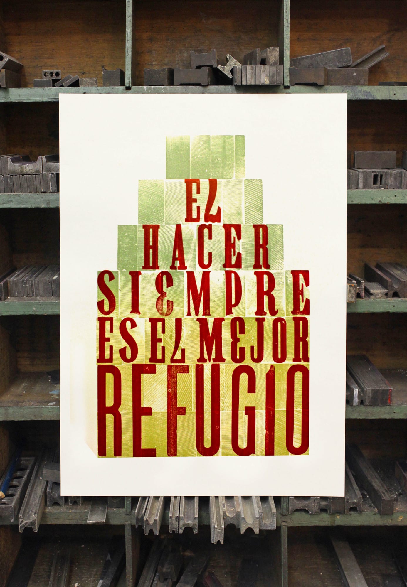
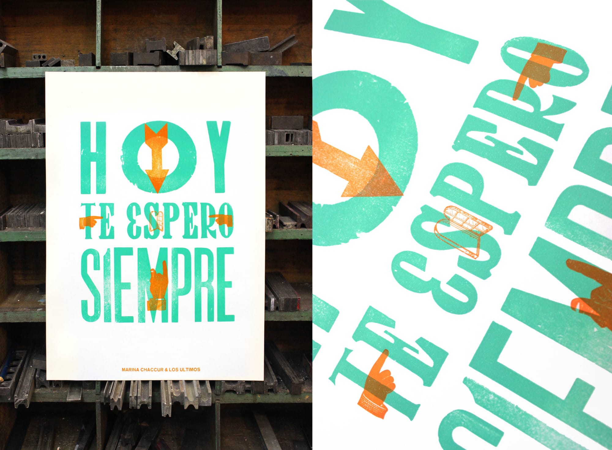
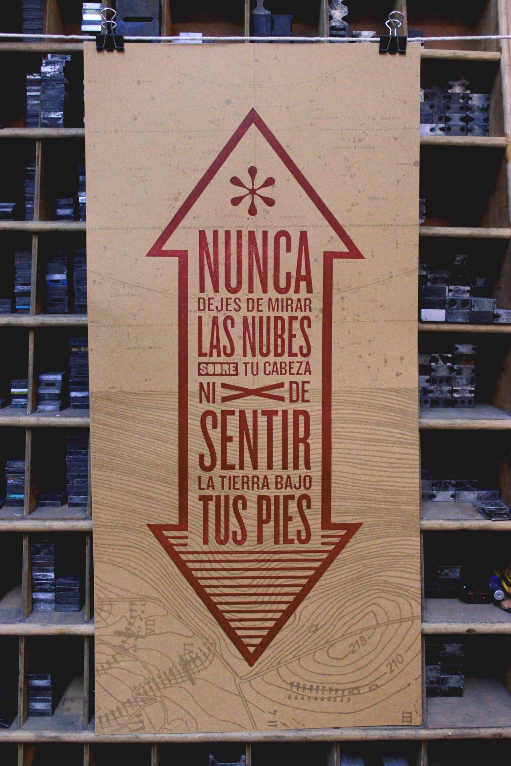
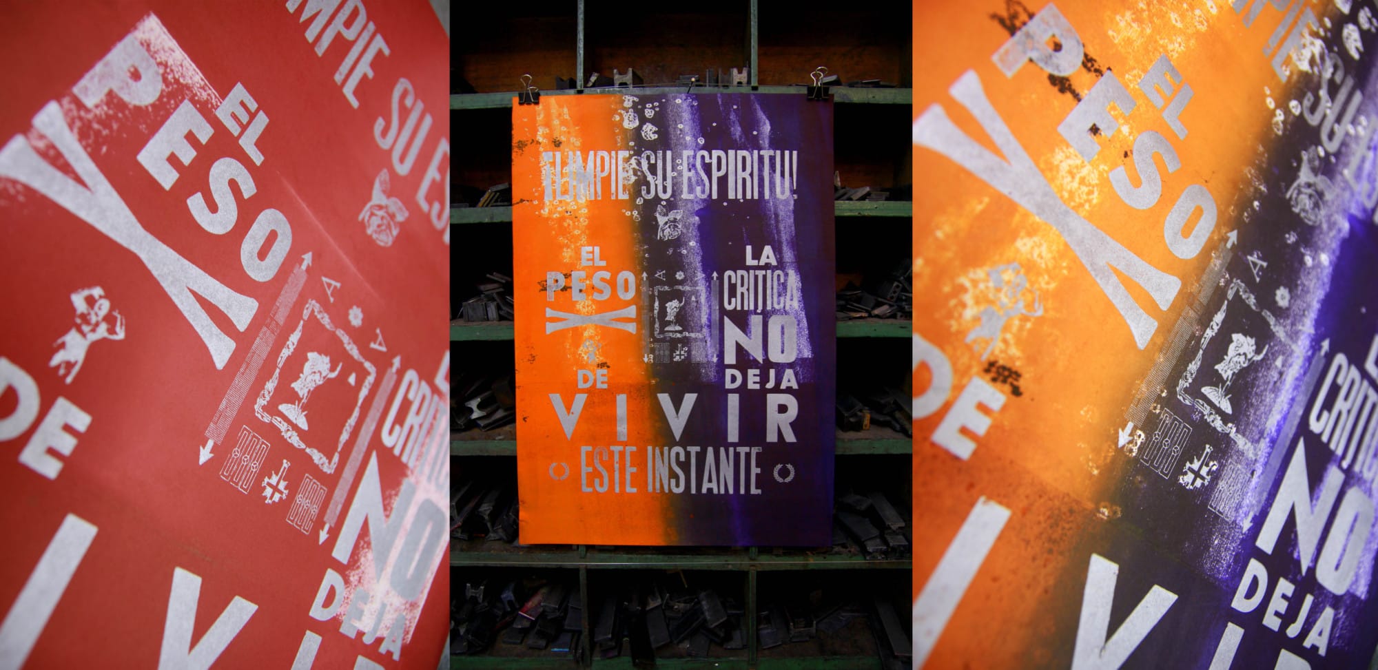
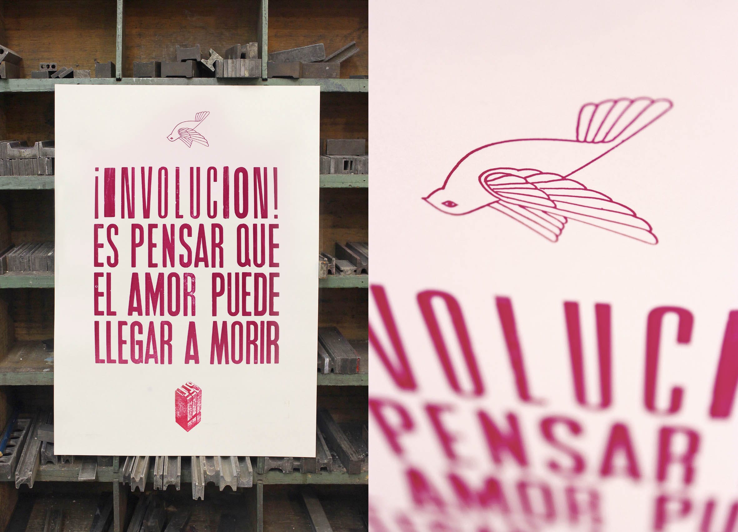
Born in Buenos Aires, Federico Cimatti, also known as Prensa La Libertad (Freedom Press) is an artist who mixes the old craft of typographic printing with poetry. His artistic works are basically posters, although they do not promote any product or event but communicate delicate metaphors and intense slogans. All these posters have a beautiful style entirely achieved with an analog process, because Cimatti doesn’t use software, instead making them with an iron matrix the old school way.
The aesthetics of Cimatti come from graphic design and print advertising. The composition of their posters refers to the synthesis, the colors and shapes accompanying the text. It gives them strength and personality. In turn, Cimatti uses fonts that can be serif or sans serif, but these fonts always appeal to the readability of the message. What does it mean that the aesthetic is related with design and advertising? It means that if one looks quickly, objects appear that have been historically and culturally created to sell products, to announce an event or to promote a particular ideological or political cause. This is the essence of the poster, one of the first tools of modern mass communication. While the origins of the typographic craft date back to the Middle Ages, the poster is a distinctly modern phenomenon that comes hand in hand with industrial production and mass migration of people from the countryside to the city. At a time when there was no television, much less the internet, the mainstream media were the newspapers, radio and obviously the poster. This one is an urban serial-made media that literally comes to meet the receiver in an attempt to capture their visual attention. The poster has a place in the visual history of cities because for a long time it has been used to impose messages and suggest behaviors. Almost all graphic languages, such as photo montages, or use of rhetorical figures such as metaphor and synecdoche, were introduced by the first applied artists, today called designers, such as those arising in the Bauhaus school or in the stream of Russian Constructivism. We, men and women of the XXI century, are fully trained to decode messages of a poster, because we grew up in a environment with clear rules for public communication of text and pictures. The aesthetics of Freedom Press can be considered typical of Buenos Aires, because here people still uses posters made with printing presses to advertise events, products and services.
However, the message of Federico Cimatti does not communicate any product or political ideology. Rather, he communicates his own point of view, sensitivity and ethics. The posters are poems, pieces of art, literary and visual compositions at the same time, where it matters what is said, how it is said and how it looks. Conventional poetry also depends on its shape, especially how it is heard when it's recited or read silently by someone, because the cadence of the words echoes in the reader's mind. The same applies to the texts of Freedom Press, but here the emphasis arises from the sense of sight, how letters and words are arranged within the space of paper, and what color the letters are. Sometimes, a letter is replaced by a number or a symbol, but the reader understands this as intentional and mentally corrects this due to their ability to understand metaphors. For example, a number 3 can be used to replace the letter E, the same happens when an inverted number 7 is used to replace the letter L. The specific font used to write the text of the poster creates a psychological and cultural connotation to the message. As Charles Peirce, founder of semiotics, explained in the past, signs have three ways of interpretation: the first is a restricted meaning, like the rules of a manual. The second level is the meaning usually assigned by society. A sign can formally mean something and at the same time can have a second sense, this is the connotation. But on the third level, meaning opens to infinity, because the receiver associates the sign with his own personal history and translates it into other signs. For example, the posters of Cimatti mean something specific, we can interpret them in a relatively objective way, but at the same time they represent the popular culture of Buenos Aires, low budget advertising, block party posters, cumbia and salsa concerts, and the imagery of Peruvian, Bolivian and Colombian immigrants in Argentina. Moreover, a slogan written with huge letters make the message seem serious and imperative. But at the same time we know that today such posters with vintage style like these have been recovered by educated youth, artists and designers from the middle and upper class, and therefore have been transformed into a cool aesthetic, like a trend, the consolidation of something that was a sign of poverty, economy and functionality, and today is ornamental art, design and entertainment.
We can say that Cimatti builds posters that are both text and images, a feature of all graphic design pictures, but in this case is not functional pictures, they exist to be contemplated, read and enjoyed. It would be much less stimulating to read the texts of these posters written on a sheet of paper or typed into a text file. Clearly they are messages that acquire their aura from their physical form. What other objects in our surrounding universe have similar features? Books, of course. Literature, whether fiction, poetry, chronicles, essays or theory, has an integrated visual component. It is the editorial layout, all about visuality, materiality and location of the texts. We refer the publishing art because Cimatti is both author and editor of his texts, he worries both content and form, therefore their materiality: the paper type, dimensions, the printing process, inks, colors, and so on are all him. He even deals with the distribution and marketing of his art. He is a perfect example of the contemporary artist who forged a name through the use of social networks. When an artist is successful on the internet, an expectant audience accumulates around him, as if it were the adventures of a fictional character. His daily work and recording process become as important as the finished works. This expectation pays off when Cimatti opens the workshop doors to sell limited copies of his posters. It is at that moment that Freedom Press leaves the home factory and enters into the intimate life of readers and collectors.
The Artist's life isn't easy and Cimatti knows it. Like everyone, he has to pay bills at the end of the month. That's why his website also shows his custom design work, posters, book covers and business cards for freelance professionals or small companies. The content and subjects of the posters are usually slogans that invite us to cultivate insight, kindness, optimism and love. We cannot say they are pessimistic or negative messages, quite the opposite. But many of these slogans have a normative tone, almost of urgency. This leads us to think that Cimatti interprets the world in which he lives as unloving, alienated, violent or even cruel. After all, he tries to be a committed artist, not for a political party, but for a cause, a personal one, a utopia based on strong ethical or spiritual convictions. To be aware, take care of the future under construction, conduct our behavior motivated by love, believe in ourselves, and be able to think on others. These are some of the main subjects displayed on posters of Prensa la Libertad. Content and trade, manual labor and handling machines, aesthetic composition, depth and ornamental discursive atmosphere. All this is combined in these objects that clearly tell us something, but are also beautiful in themselves, beyond their message. Finally, talking about materiality of the posters, they are mainly made with analog technology, a deep involvement of the artist in the mechanical process of design and printing. As mentioned at the beginning, Cimatti uses old printing presses that have iron letters, numbers and symbols that must be passed by inks of different colors. He also uses various types of papers, some very thin, ideal to be stuck on the wall, and others thicker, which are usually hung or framed. Since the printing machine of Cimatti is literally a press, by pressing the metal letters against the paper, he can achieve different types of relief and texture to the poster depending on the pressure applied in the printing process.
If you want to follow this artist can do through Facebook or visiting his personal web page.
Facebook´s fan page: https://www.facebook.com/prensalalibertad/?fref=ts

